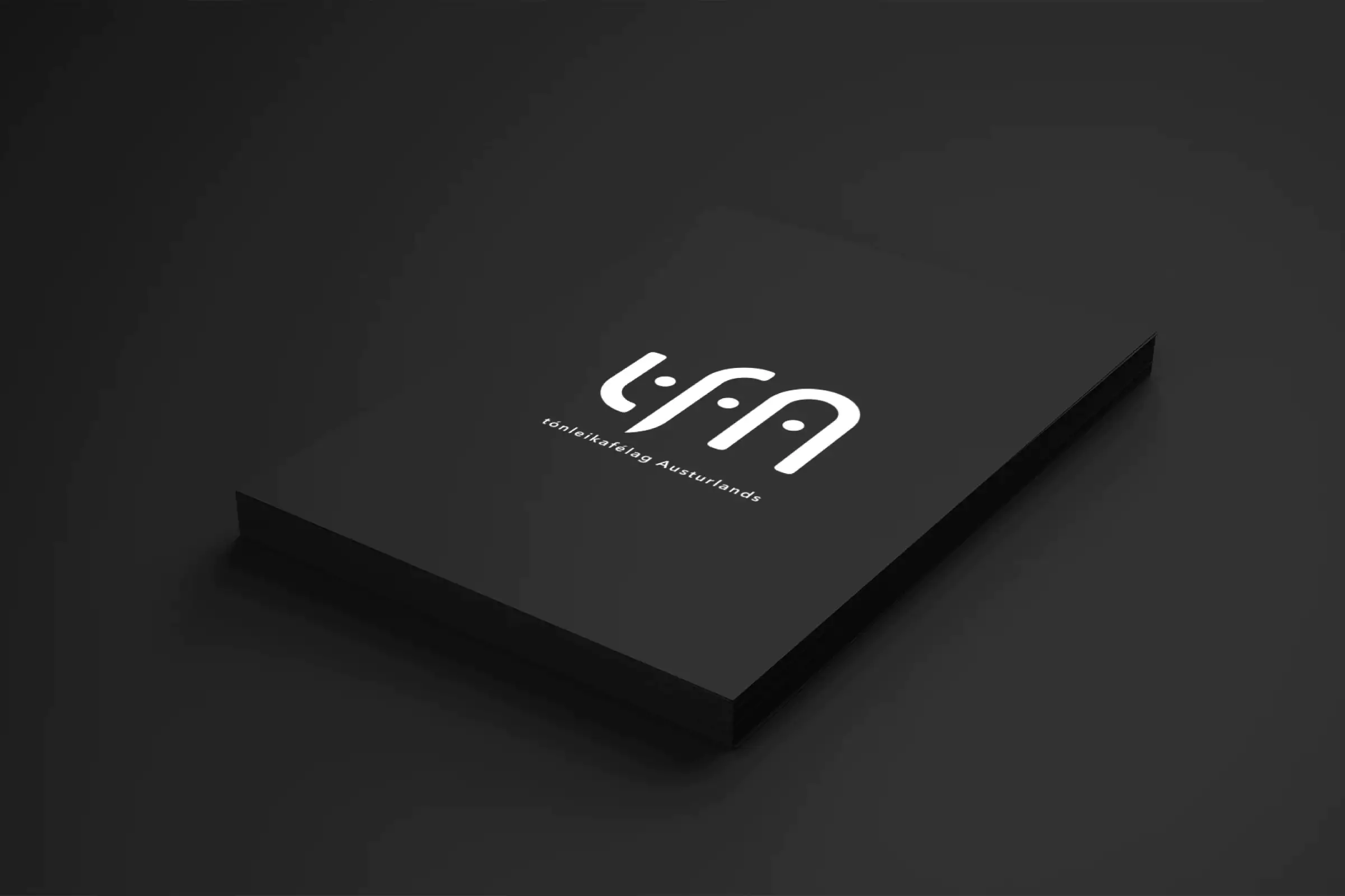
The logo
After many different approaches to designing a logo for Tónleikafélag Austurland, it first worked when I looked for inspiration at the roots of music: In rhythm and tones.
The lines in the logo refer to sound waves, while the dots represent a continuous beat. The rounded corners of the posts provide a softness that offsets their dynamic thickness.
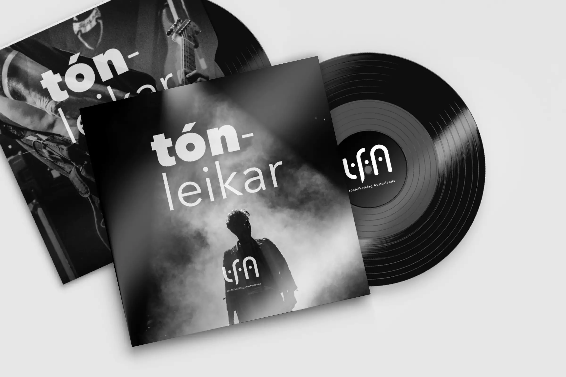
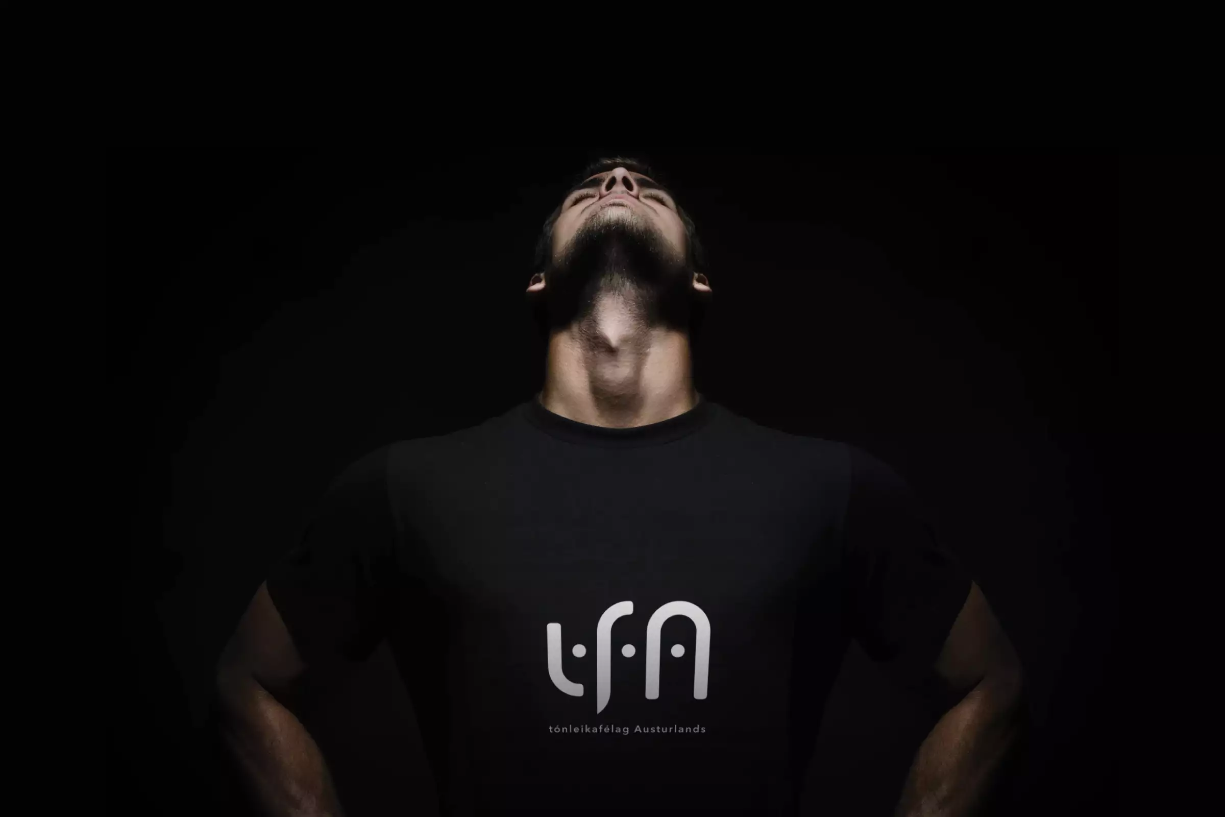
The result is a simple and stylish logo consisting of the company’s acronym, tfA. The simplicity means that the logo can be used in many situations, on many backgrounds and goes well in digital display as well as in print.
Various human features can be identified in the logo: Face, eyes, ears and more. Because without the human, a concert will never be a concert. And the more often you look at the logo, you can see more appearing in it.